- Home
- What Is Geography
- Terminology
-
Curriculum
- Rationale and Aims
- Strands and Standard Elaborations
- Geograhy Competitions
- Year 7 >
-
Year 8
>
-
Year 9
>
-
Year 10
>
-
Geographies of Human Wellbeing
>
- Representing Wellbeing
- Happiness and Life Satisfaction
- UN Sustainable Development Goals
- Wealth and Income
- Access to Water
- Sanitation
- Colonisation
- Natural Resources and Minerals in Africa
- Gender Imbalances
- Wellbeing in Australia
- Strategies to Improve Wellbeing: Healthcare
- Strategies to Improve Wellbeing: Infrastructure
- Strategies to Improve Wellbeing: Education
- Organisations Improving Wellbeing
- Environmental Change and Management >
-
Geographies of Human Wellbeing
>
- Senior Geography >
-
Mapping
- Mapping Terminology
- Mapping Conventions BOLTSS
- World Maps
- World Map Projections
- Countries by Area - Largest and Smallest
- Continents and Oceans
- Regions
- Countries, States & Nations
- Types of Maps
- Choropleth Maps
- Synoptic Charts (Weather Maps)
- Direction
- Latitude and Longitude
- GPS
- Area and Grid Referencing
- Scale
- Relief
- Maps Showing Location
- Maps Showing Topography
- Maps Showing Transport
- ArcGIS
- Map Spatial Patterns and Relationships
- Cool Maps (Geography)
- Cool Maps
- Graphing
-
Skills & Figures
- Data
- Tables of Data
- Methodology in Reports
- Analysing: PQE Method
- Analysing: Calculations
- Analsying: SHEEPT Method
- Referencing
- Captions for Figures
- Referring to Figures in Reports
- Annotating Figures
- Overlays
- Photographs
- Satellite Images
- Images of a Location
- Representing Distance
- Representing Change Over Time
- Diagrams
- Fieldwork
- Interesting
- Resources
- News
- Make A Difference
- Careers
Global Temperature Anomalies, 1880 - 2021
By NASA Climate Change
2022 [1:10]
Description: This visualization shows monthly global temperature anomalies (changes from an average) between the years 1880 and 2021. Whites and blues indicate cooler temperatures, while oranges and reds show warmer temperatures. As you can see, global temperatures have warmed from mainly human activities as time has progressed. These temperatures are based on data from NASA's Goddard Institute for Space Studies (GISS). Anomalies are defined relative to a base period of 1951 to 1980. The data file used to create this visualization can be accessed here:
The "climate spiral" is a visualization designed by climate scientist Ed Hawkins from the National Centre for Atmospheric Science, University of Reading: https://www.climate-lab-book.ac.uk/sp....
Temperature Anomalies by Country 1880-2017
2018 [00:36]
Description: Temperature Anomalies by Country 1880-2017 based on NASA GISTEMP data.
2018 [00:36]
Description: Temperature Anomalies by Country 1880-2017 based on NASA GISTEMP data.
Global Temperature Anomalies from 1880 to 2021
2022 [00:30]
By NASA Scientific Visualization Studio
Description: This color-coded map in Robinson projection displays a progression of changing global surface temperature anomalies. Normal temperatures are shown in white. Higher than normal temperatures are shown in red and lower than normal temperatures are shown in blue. Normal temperatures are calculated over the 30 year baseline period 1951-1980. The final frame represents the 5 year global temperature anomalies from 2017-2021. Scale in degrees Celsius.
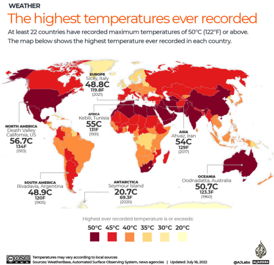
(Al Jazeera)
Read more here: What is the highest temperature ever recorded in your country? | Infographic News | Al Jazeera

- Home
- What Is Geography
- Terminology
-
Curriculum
- Rationale and Aims
- Strands and Standard Elaborations
- Geograhy Competitions
- Year 7 >
-
Year 8
>
-
Year 9
>
-
Year 10
>
-
Geographies of Human Wellbeing
>
- Representing Wellbeing
- Happiness and Life Satisfaction
- UN Sustainable Development Goals
- Wealth and Income
- Access to Water
- Sanitation
- Colonisation
- Natural Resources and Minerals in Africa
- Gender Imbalances
- Wellbeing in Australia
- Strategies to Improve Wellbeing: Healthcare
- Strategies to Improve Wellbeing: Infrastructure
- Strategies to Improve Wellbeing: Education
- Organisations Improving Wellbeing
- Environmental Change and Management >
-
Geographies of Human Wellbeing
>
- Senior Geography >
-
Mapping
- Mapping Terminology
- Mapping Conventions BOLTSS
- World Maps
- World Map Projections
- Countries by Area - Largest and Smallest
- Continents and Oceans
- Regions
- Countries, States & Nations
- Types of Maps
- Choropleth Maps
- Synoptic Charts (Weather Maps)
- Direction
- Latitude and Longitude
- GPS
- Area and Grid Referencing
- Scale
- Relief
- Maps Showing Location
- Maps Showing Topography
- Maps Showing Transport
- ArcGIS
- Map Spatial Patterns and Relationships
- Cool Maps (Geography)
- Cool Maps
- Graphing
-
Skills & Figures
- Data
- Tables of Data
- Methodology in Reports
- Analysing: PQE Method
- Analysing: Calculations
- Analsying: SHEEPT Method
- Referencing
- Captions for Figures
- Referring to Figures in Reports
- Annotating Figures
- Overlays
- Photographs
- Satellite Images
- Images of a Location
- Representing Distance
- Representing Change Over Time
- Diagrams
- Fieldwork
- Interesting
- Resources
- News
- Make A Difference
- Careers