Choropleth Maps
What is a Choropleth Map?
A choropleth map is a thematic map in which areas are shaded in proposition to the measurement of the statistical variable being displayed on the map, such as population density or income per capita.
In other words, it is a map which displays data using colour.
The word ‘choropleth’ comes from two Greek words:
Choropleth maps provide an easy way to visualise how a measurement varies across a geographic area. It is an effective way of representing data as spatial variations and patterns can be easily identified.
Choropleth maps are the most common type of map used by population analysts.
In other words, it is a map which displays data using colour.
The word ‘choropleth’ comes from two Greek words:
- choros meaning ‘area/region’
- plethos meaning ‘number
Choropleth maps provide an easy way to visualise how a measurement varies across a geographic area. It is an effective way of representing data as spatial variations and patterns can be easily identified.
Choropleth maps are the most common type of map used by population analysts.
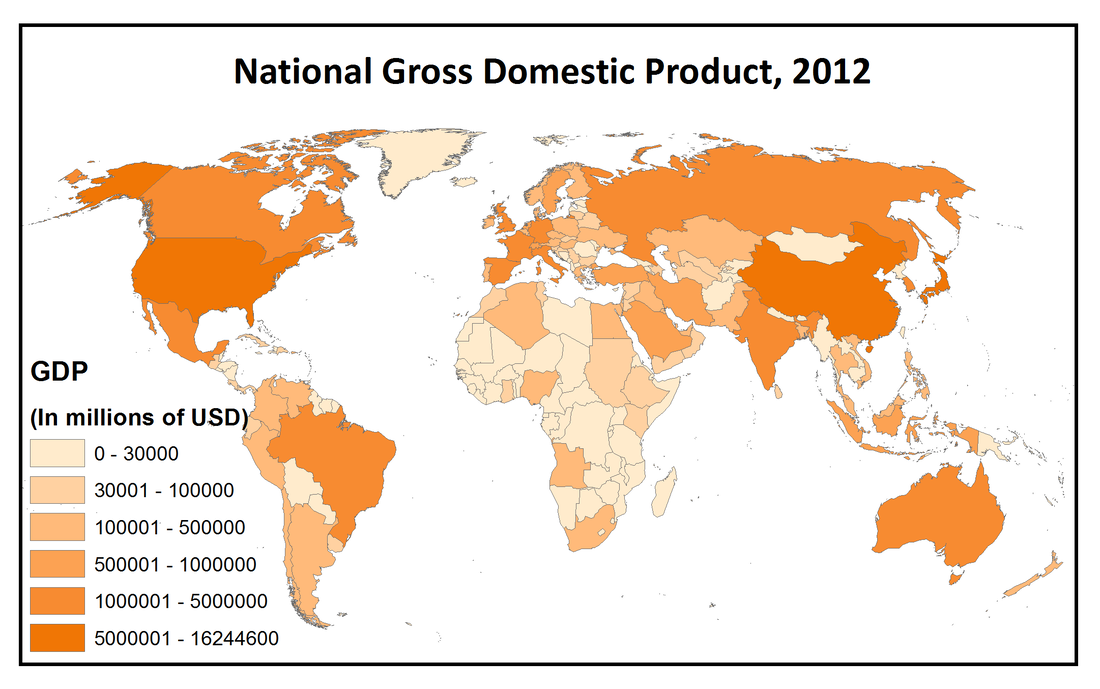
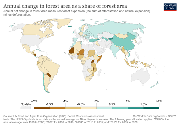
Example of a Choropleth Map
Aim of Choropleth Maps
The aim in choropleth mapping is to reduce the total set of data values into meaningful classes that will then be portrayed on the map.
We may have data ranging from 1 to 2,000,000 from a city, but we can generalise it into 4-10 general classes.
This mapping is thus an exercise in moving from the specific to the general.
There are advantages and disadvantages to representing data this way (see 'Analysing the Map' at the bottom of the page)
General Rules
Choropleth maps use shading, symbols and colour to show average density or concentrations of features or values, such as population density or income per capita.
|
Colours and Shading
|
The map must be monochromatic - use different shades of one colour only.
For data with positive and negative numbers, you can use two different colours e.g. green = positive, red = negative (scroll down for examples) Shadings should be graded from the darkest to lightest shade:
Shading Assign a shade for each class and create a legend on the map. Shade in the regions on your map according to your legend. You could also use lead pencil. The map user should be able to easily identify the implied magnitude of the hue (spectrum of colour) and to match it with the legend. |
|
Classes
(aka Categories) |
Hand drawn maps usually contain 4-5 classes (4 is recommended to be able to effectively distinguish between the shades).
There could be more classes for positive and negative numbers if two colours are being used, but it is recommended to have a maximum of 4 classes for each colour. Classes do not need to have the same value range but should be based on appropriate groupings (see 'Data Classification Methods' below). All classes should be represented on the map. The boxes for the classes in the legend should be ruler-drawn, neat squares. Ensure that the values (numbers) in the legend:
If using, ensure the less than/greater than symbols are applied correctly. The symbol should be on the left hand side of the number as this communicates that the value is less than or greater than the number (25 in this case).
|
Choropleth Maps with positive and negative values
For positive and negative numbers, consider which colours are most relevant.
- Green and red are the obvious ones for showing changes, with green for positive values and red for negative values. This enables the reader to interpret the map more effectively as we usually associate the colour green with being positive and red with being negative. (examples below)
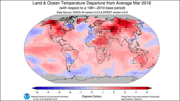
- Blue and red is often used for temperature anomaly maps, blue representing cooler than average temperatures and red for warmer than average temperatures. (example below)
Steps
- Examine the data and divide into suitable classes using one of the data classification methods below.
- Include a legend that shows the value range for each shade of colour.
- Select a different shade of the one colour for each of the classes.
- Colour in your map.
Data Classification Methods
Each data classification technique produces unique choropleth maps, but they all paint a different story to the map reader.
The one thing you must realise is that you’re using the same data in each choropleth map, but what’s really changing is how you classify and represent the data.
To find the range of data:
The one thing you must realise is that you’re using the same data in each choropleth map, but what’s really changing is how you classify and represent the data.
To find the range of data:
- Identify the highest and lowest value.
- Subtract these two numbers
|
Equal Interval
Data Classification |
This method divides the classes into equal groups.
It works best for data that is generally evenly spread across the entire range. To determine the classes:
Avoid the equal interval method if the data is skewed, or clumped, to one end. |
Example
For 125 countries in total:
|
|
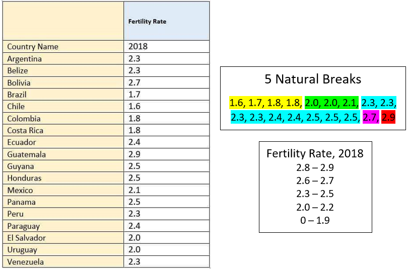
Quantile
(Equal Count) Classification |
This method tries to have the same count of features in each of the classes. In other words, quantile maps try to arrange classes so they have the same quantity.
As a result, the shading will look equally distributed in quantile types of maps. To determine the classes:
Despite the balanced style in quantile choropleth maps, they can also be misleading. They are misleading because people tend to look at a shade and group it in the same category. |
Example
For 125 countries in total:
|
|
Natural Breaks
(Jenks) |
This method acts to adjust break values along natural groupings of data.
It is best for data which is skewed, or clumped, to one end. To determine the classes:
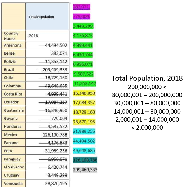
|
Example
For 125 countries in total:
|
Analysing the Map
When interpreting choropleth maps it is important to remember that considerable differences can exist within an area, even though areas may have the same colour or type of shading.
World maps, for example usually present data for particular countries. National borders often become the boundaries between different ranges of values, resulting in generalisations and the neglect of localised variations in the feature being mapped.
World maps, for example usually present data for particular countries. National borders often become the boundaries between different ranges of values, resulting in generalisations and the neglect of localised variations in the feature being mapped.
|
Advantages
|
Disadvantages
|
