Compound Graphs
KEY TERMS
Discrete data can only take certain values, e.g. whole numbers, or shoe sizes.
Continuous data is measured, e.g. length, time, and can take any value.
Categorical data is where there is no numerical value, but data can still be sorted into groups, e.g. preferences from an interview.
Discrete data can only take certain values, e.g. whole numbers, or shoe sizes.
Continuous data is measured, e.g. length, time, and can take any value.
Categorical data is where there is no numerical value, but data can still be sorted into groups, e.g. preferences from an interview.
- Combines different sets of data in one bar.
- Needs a key to show what each colour section represents.

Compound column graph [discrete, quantitative data] (Guide to Maths for Geographers, Pearson Education Ltd. p10)
|
When asked to interpret or describe specific data from the graph above, the frequency will need to be converted to a percentage.
For example, when describing how many students attained an A+ (A*) in Chemistry,
|
Working out the percentage of chemistry students who got an A*, or A+.
Formula for working out percentages: 20/80 x 100 = 25 The percentage of chemistry students who got an A+ (A*), is 25%. For more information about calculations:
|
It can be more difficult to read the intermediate values on the graph i.e. students achieving an A grade (indicated by the orange colour).
60-30 = 30 stduents to achieved an A grade in their exam.
To double check, you could add all of the values to see if it adds up to the total frequency e.g. 30 (blue/B) + 30 (orange/A) + 20 (green/A*) = 80
60-30 = 30 stduents to achieved an A grade in their exam.
To double check, you could add all of the values to see if it adds up to the total frequency e.g. 30 (blue/B) + 30 (orange/A) + 20 (green/A*) = 80
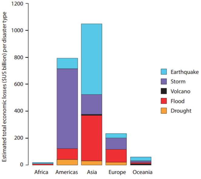
Economic losses caused by natural disasters, 1998-2012 (Guide to Maths for Geographers, Pearson Education Ltd. p11)
The interpretation of this compound column graph is more demanding.
