Scattergraphs
KEY TERMS
Correlation: A relationship or connection between two things. The tendency for two values or variables to change together, in either the same or opposite way.
Anomaly: something that deviates from what is standard, normal, or expected. In other words, something that is unusual or unexpected.
Correlation: A relationship or connection between two things. The tendency for two values or variables to change together, in either the same or opposite way.
Anomaly: something that deviates from what is standard, normal, or expected. In other words, something that is unusual or unexpected.
The Name
Scattergraphs are also referred to as 'Scatter plots', 'Scatterplot graphs', 'Scatter diagrams'.
It may be called one of these names in mathematics, and different Geography resources will call them slightly different names.
On Microsoft Excel they are called 'X Y (Scatter)'.
It may be called one of these names in mathematics, and different Geography resources will call them slightly different names.
On Microsoft Excel they are called 'X Y (Scatter)'.
Purpose
A scattergaph plots two sets of data on the same graph to see if there is a relationship or correlation between them.
Scattergraphs can show positive, negative or no correlation (more information about this below under 'correlation').
In Geography, scattergraphs can be used to 'tell geographical stories', for example the relationship between health and social problems in a particular region of the world.
Scattergraphs can show positive, negative or no correlation (more information about this below under 'correlation').
In Geography, scattergraphs can be used to 'tell geographical stories', for example the relationship between health and social problems in a particular region of the world.
Variables (Independent and Dependent)
Variables can be either dependent or independent.
Independent Variable (X Axis – Horizontal):
The independent variable is what a country can control directly. It is called independent because its value does not depend on and is not affected by the state of the other variable.
Examples:
Dependent Variable (Y Axis – Vertical):
The dependent variable usually responds to a change in the independent variable, so you can think of it as depending on the independent variable.
Examples:
- An independent variable stands alone and is not affected or changed by the other variable.
- A dependent variable does not stand alone; it is affected by the other variable.
Independent Variable (X Axis – Horizontal):
The independent variable is what a country can control directly. It is called independent because its value does not depend on and is not affected by the state of the other variable.
Examples:
- The amount of money a country spends on education
- The percentage of the population with access to clean drinking water.
Dependent Variable (Y Axis – Vertical):
The dependent variable usually responds to a change in the independent variable, so you can think of it as depending on the independent variable.
Examples:
- Life expectancy
- Infant Mortality Rate (IMR)
Line of Best Fit
It is a straight diagonal line drawn through the points, attempting to have a similar number of points on either side of the line.
It is used to show the type of relationship.
It must be drawn with a ruler.
It does not need to go through (0, 0) or the origin (aka the very bottom left hand corner of the graph). It should stop at the first or last plot point.
It is used to show the type of relationship.
It must be drawn with a ruler.
It does not need to go through (0, 0) or the origin (aka the very bottom left hand corner of the graph). It should stop at the first or last plot point.
Correlation
Correlation is when two sets of data are linked.
Strong and weak correlations occur depending on the strength of the relationships between data.
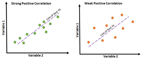
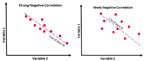
The closer the points are to the line of best fit, the stronger the relationship.
In mathematics, you may be required to plot data on a scattergraph as small crosses e.g. x. In Geography, the points are usually plotted as clear distinct dots.
Notes:
Strong and weak correlations occur depending on the strength of the relationships between data.
The closer the points are to the line of best fit, the stronger the relationship.
In mathematics, you may be required to plot data on a scattergraph as small crosses e.g. x. In Geography, the points are usually plotted as clear distinct dots.
Notes:
- The terms for the correlation, positive or negative, doesn't mean that the relationships are good or bad. They just describe the relationship of the two variables. For example, as the percentage of people who have access to safe drinking water increases, child mortality rates should decrease. This is a negative correlation but it is positive for the people who live in that region as it means that less children are dying.
- Correlation does not imply causation. Sometimes there may be another factor that affects both variables, or there may be no connection between them at all. For example, there is positive correlation between number of ice creams sold and death by drowning, but it is unlikely that one causes the other (i.e. directly causal). A more likely explanation is a third factor – temperature. On hot days more people buy ice creams and more people swim, leading to increased numbers of drownings.
|
Positive Correlations
The points show a positive correlation or gradient. A positive correlation occurs when as one variable increases, the other increases. Example: As access to safe drinking water (as a percentage of the population) increases, life expectancy is also likely to increase. |
|
Negative Correlations
The points show a negative correlation or gradient. A negative correlation occurs when as one variable increases, the other decreases. Example: As the number of absences increases for students, their grades will likely decrease. |
|
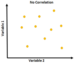
No Correlation
There is no pattern to the points when the dots are scattered on the graph. Drawing a line of best fit is not possible. This shows that there is no correlation between the two variables. Example: This would happen if you plotted variables like GNI per capita and the number of people that play soccer. They don’t have any relationship to each other. |
Plotting Countries or Regions
When plotting countries or regions on a scattergraph, there are a few options based on the data you are working with:
- Use different colour plots for each region e.g. blue dots for countries in Africa, red dots for countries in North America etc.
- Write country codes on the graph and use a key to outline the codes e.g. Au = Australia
Anomalies
Data that does not fit the trend or pattern in the graph in considered to be an anomaly.
In a scatterplot a point that stands out from the rest is an anomaly.
In a scatterplot a point that stands out from the rest is an anomaly.
Analysing Scattergraphs
Describing the correlation
1. Outline whether the correlation is weak/medium/strong
2. Outline whether the relationship is positive/negative
3. Describe what happens to the dependent variable when the independent variable increases/is higher
Examples:
Explaining reasons for the correlation
When asked to explain the correlation, this is to comment on the geographical meaning or relevance of the relationship or correlation.
Identify possible reasons (e.g. social, economic, environment) for the correlation. Explain in detail.
Relate it back to the two variables showing the correlation.
Examples
1. Outline whether the correlation is weak/medium/strong
2. Outline whether the relationship is positive/negative
3. Describe what happens to the dependent variable when the independent variable increases/is higher
Examples:
- There is a medium negative correlation between access to safe drinking water and Infant Mortality Rates. When there is a higher percentage of the population who have access to safe drinking water, Infant Mortality Rate is generally lower.
- There is a medium positive relationship between GDP per capita and life expectancy. A higher GDP per capita generally results in a higher life expectancy.
- There is a strong positive correlation between the percentage of a country’s GDP being spent on education and the adult literacy rate. When a country increases their spending on education, adult literacy rates also increase.
Explaining reasons for the correlation
When asked to explain the correlation, this is to comment on the geographical meaning or relevance of the relationship or correlation.
Identify possible reasons (e.g. social, economic, environment) for the correlation. Explain in detail.
Relate it back to the two variables showing the correlation.
Examples
- A possible reason for this relationship is ….
- A relationship between the two variables exists because …
- Factors which contribute to …
